 EN
EN FR
FR
How can the CDC ignore their own gold-standard data? The data shows the COVID vaccines were a huge failure and increased all-cause mortality, exactly the opposite of what was promised.
Executive summary
This article has four new charts from Medicare data that have never been revealed publicly.
Key takeaways:
- The COVID vax increased baseline risk of death in the elderly by over 10%. This is very consistent with what Denis Rancourt and others have found.
- Since April 2022, the unvaccinated fared better than the COVID vaccinated from a mortality perspective (this could be true earlier than April 2022, but I currently lack the data to show this): there were no COVID “humps” and the seasonal increase in mortality was lower than for the vaccinated.
- COVID hasn’t been killing anyone since April 2022 in any significant numbers. This means that there was absolutely no reason for anyone to get a booster shot after April 2022. Even if the vaccine were safe and worked perfectly, there is no data supporting such a need.
- The flu vaccines have a “Day 0” mortality rate that exceeds the “1 excess death per M doses” criteria for a safe vaccine. The flu vaccines are clearly unsafe and should be immediately pulled from the market. Flu vaccines also have no hospitalization benefit whatsoever as was pointed out in a JAMA paper published in April 2023. The flu shots simply kill people for no benefit. The data is in plain sight for all to see.
- The CDC never cites the Medicare data as proof of vaccine safety and efficacy for any vaccine because the data shows the opposite. All data is kept hidden from public view. So you’ll never see any of the graphs shown in this article from the CDC even though they have the data. They basically only publish data that fits the narrative.
- The mRNA COVID vaccines should be pulled from the market. They are literally doing the opposite of what was promised.
- The flu vaccine should be pulled as well. While the flu vaccine isn’t nearly as deadly as the COVID vaccine, it is an unsafe vaccine with no measurable clinical benefit.
If the vaccines were safe, the CDC would be inviting all the top “misinformation spreaders” to CDC headquarters to do as many queries as we would like on VSD, Medicare, and Medicaid. But there is no such open invitation. On the contrary, they immediately cut off database access to anyone who ever gets close to finding something that goes against the narrative like they did with Brian Hooker when he was researching the link between vaccines and autism.
We are open to being challenged on the data, they are not
Unlike the world’s health authorities, those of us who challenge the “scientific consensus” embrace open debate and challenge.
If there are any epidemiologists who would like to challenge me on the interpretation of the charts below or challenge Denis Rancourt on his paper, simply respond in the comments below.
Definitions
HVE: The healthy vaccinee effect. This depresses the mortality rates observed within around 30 days after a vaccine is given. The reason for this effect is because people who are in hospice and hospitals aren’t generally injected with vaccines. Therefore, if you track deaths on the first 30 days after a vaccine is given, it will normally show impossibly low death rates. High death rates on Day 0 are therefore a huge safety red flag. The 30 day period is observed in other vaccines and other countries.
Baseline death rate: The lowest rate of death over a 365 day period for a given cohort, e.g., the death rate when nothing special is going on in the background. Even with things like COVID going on, because COVID typically comes in waves, the mortality rate will normally spend a significant amount of time at or near the baseline rate during a 365 day yearly cycle.
Summary of the key points in the analysis below
The analysis below follows a fixed cohort that was defined by “those in Medicare who got their first shot in March 2021.”
We follow that group of people over time and find that their baseline death rate has increased from their baseline measured shortly after getting the shot.
We also show that the effect is happening within the first 120 days for certain because the deaths per day slope is positive even though all-cause deaths are decreasing (due to seasonality). In short, if you got the shots, your mortality is going up when it should be going down. We see this in other countries as well after the shot is given.
Figure 1: Influenza vaccine death data. We can calculate a baseline mortality rate for 81-year-olds in Medicare who get vaccines using the influenza vaccine data. We’ll use this rate in the next step as one of the 2 ways to compute baseline mortality. This was a cohort with an average age of death of 81, which is one year older than the COVID cohort in the next step.
Figure 2: COVID vaccine death data. Medicare participants vaccinated with the COVID vaccine start off at the normal baseline death rate (which we compute two independent ways just to make sure), but after the shots, their “baseline death rate” has increased by more than 10%. This is a huge problem. The second huge problem is that the slope of the death curve in the first 120 days should be downward. It isn’t. The slope is going “the wrong way” for a safe vaccine. We see this in other countries. It means that the vaccines are causing higher death rates than would be expected from seasonality (and from all-cause death rates as we show in Figure 3).
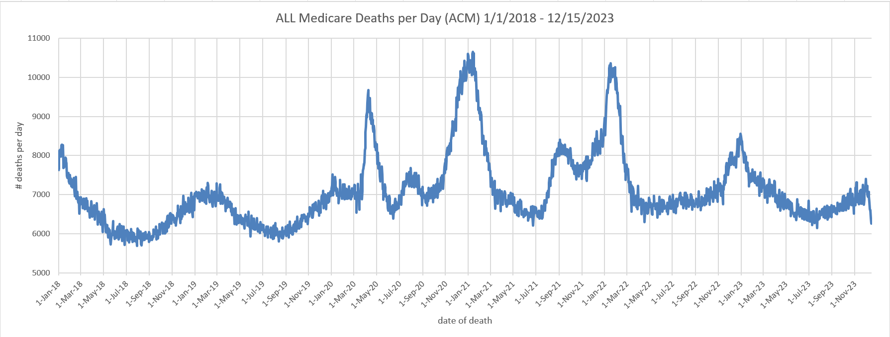
Figure 3: Medicare all-cause mortality death data. We can see that the baseline death data for Medicare recipients since the vaccine rollout is around 10% higher than we’d expect from recent historical data.
Figure 4: Unvaccinated death data. This shows that after April 2022 (when our unvaccinated cohort has a stable population), we can see no COVID waves and a very mild seasonal death wave. What this means is that the COVID boosters, even if they worked, would have no benefit since people aren’t dying of COVID (no “COVID waves”). In short, it was irresponsible for any doctor to recommend the COVID vaccine after April 2022 because there was simply no need.
Figure 1: The annual flu vaccine is an effective way to establish baseline mortality rates in Medicare for those who opt to be vaccinated
Figure 1 shows the deaths per day for Medicare patients who got the flu vaccine in 2021 (mostly in October). The x-axis is the days after the shot was given. The y-axis is the deaths on that day.
First, we can clearly see that the flu vaccine is an “unsafe vaccine” meaning it kills more than 1 person per million people injected (see my earlier article on Paul Offit for details on where this metric comes from). See the day 0 deaths? 2131 deaths on Day 0 vs. a 914 (or lower) baseline so at least 1,217 excess deaths caused by the vaccine.
Since 23M were injected in Figure 1, we should never see more than 23 excess deaths if the vaccine is safe (since the safe threshold is 1 excess death per M doses). We have 53X higher deaths than is safe on Day 0. We do not see this type of “Day 0 excess death effect” with the COVID vaccine in any jurisdiction so this is not some sort of artifact. This is vaccine dependent. This illustrates the level of corruption at the CDC that they have never revealed to the public that the flu vaccine is demonstrably unsafe.
Every honest infectious disease doctor should be calling for an immediate halt to the flu vaccines. But there aren’t any honest infectious disease doctors left in the world it seems, so nobody is speaking out. Nobody. Complete silence. They don’t want to touch this with a 10-foot pole. They just want to ignore it because to acknowledge it would destroy trust in the medical community. So they look the other way while people are being killed by these vaccines.
We can use the statistics in Figure 1 to calculate a baseline death rate where we define “baseline” as the lowest death rate for the cohort expected over a 1 year period. The baseline death rate per annum is calculated from:
baseline death rate per annum = (avg deaths per day during a trough/total vaccinated)*365*100
Filling in the numbers, we get:
baseline death rate per annum = 2457/23147863*365*100 = 3.87%
So a 3.87% annual mortality rate for a Medicare cohort who submits to vaccination with an average age of death of 81 years old. The trough is calculated 180 to 270 days after the shot is given to avoid the seasonality spike which happens because the vaccine is typically given in October.
This number is critically important.
Using the death rate of the flu vaccine is key for 3 reasons:
- The flu vaccine is very popular so the numbers are very large. By looking at deaths over 90 days (which make the numbers larger), we can calculate a baseline death rate that is extremely accurate (95% confidence of less than 0.5% error).
- Because the numbers are large (there are only around 60M people in Medicare so 23M is a good sample size), we are not likely looking at an unrepresentative sample
- This is much much better than using overall Medicare death numbers because you are always guessing about the denominator with Medicare death rates. Using a medical intervention as a way to select patients (and set a denominator) is a very accurate method since we precisely know the numerator and the denominator.
Also, you can clearly see the “healthy vaccinee effect” (HVE) which depresses death rates at the beginning of a vaccination campaign lasting around 30 days. After that point, the death rates are comparable to what might be predicted by extending the mortality curves. The HVE effect is around 30 days or less in all countries where we have “days since dose” vaccination data. It is particularly obvious in vaccines that are given more evenly over time such as the pneumococcal vaccine; there the death rate is a straight line except at the very start of the period. I keep challenging people who claim HVE lasts >30 days to show me evidence of this in any previous vaccine and they never produce any evidence; they just keep making the claims based on hand-waving arguments.
Key takeaways:
- Baseline death rate of 3.87% annual mortality in an unrestricted Medicare cohort with an average age of death of 81 years old.
- The flu vaccines are unsafe because they cause 52 excess deaths per M doses, which exceed the 1 death per M doses safety threshold.
- Confirmation that HVE lasts 30 days.
Figure 2: If you got the jab, your baseline mortality rate goes up by more than 10% for at least a year
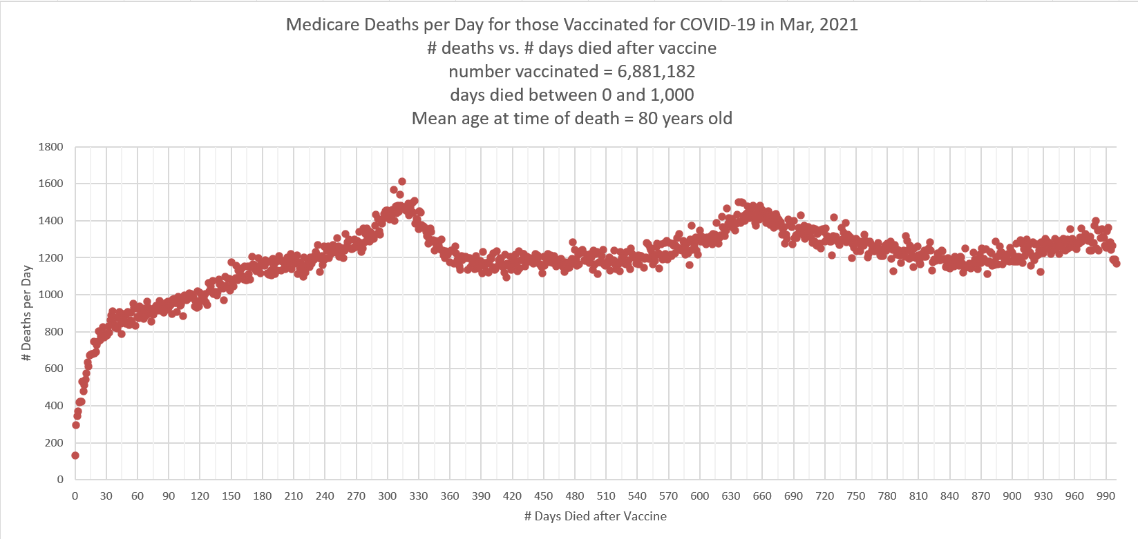 |
Figure 2 shows the number of people who died each day after getting their first COVID shot in March 2021. Note that we have the same 30 day HVE effect as we saw above for the flu vaccine (the slope changes dramatically at 30 days because of this).
So the baseline death rate of this group we’d estimate to be at the 30 day period, after HVE ends, because that’s the lowest datapoint.
The baseline deaths averaged from day 28 to 32 is 791 deaths a day.
Let’s see what we should expect as a “baseline deaths per day” based on the 3.87% annual death rate we observed above. That was for an average of 81-year-olds and our cohort is 1 year younger, so using 3.87% should estimate a slightly higher baseline number than the true baseline for this cohort. Let’s see what we get.
baseline deaths per day = total vaccinated*baseline death rate per annum /(365*100)
Filling in the numbers, we get:
baseline deaths per day = 6881182 * 3.87 / (365*100) = 730 deaths per day estimated from the flu baseline death rate
So the lower estimate is a bit of a surprise. There are several possible causes for this:
- HVE in the case of the COVID vaccine is shorter than for the flu vaccine. This is plausible because there was a rush to give the COVID vaccine to everyone in order to protect other people. This is not the case for the flu vaccine.
- There can be statistical noise in the measurements. The std deviation for 791 deaths a day is 28 so we are slightly more than 2 std deviations apart in our estimates.
- Some combination of above.
Let’s give the vaccine the benefit of the doubt and let’s pick the most conservative baseline which is the higher number: 791 deaths per day.
As you can see from the graph, we have an instant problem because the baseline numbers after the first seasonal peak is at least 1,093 deaths per day, a whopping 38% increase in the baseline death rate after someone has been vaccinated.
This should be cause for huge concern in any honest society. People clearly started dying at a rate of under 800 deaths a day and now they are dying at a rate of over 1000 deaths a day. It’s the same cohort of people. And this was not caused by some temporary event like a COVID wave because that comes in waves. This is a consistent elevation in the baseline death rate if you got the shot.
They should pull the drug.
The other important feature is the slope of the line in the first 120 days. See how it slopes up?
Now let’s look at Figure 3 below, but averaged over 30 days:
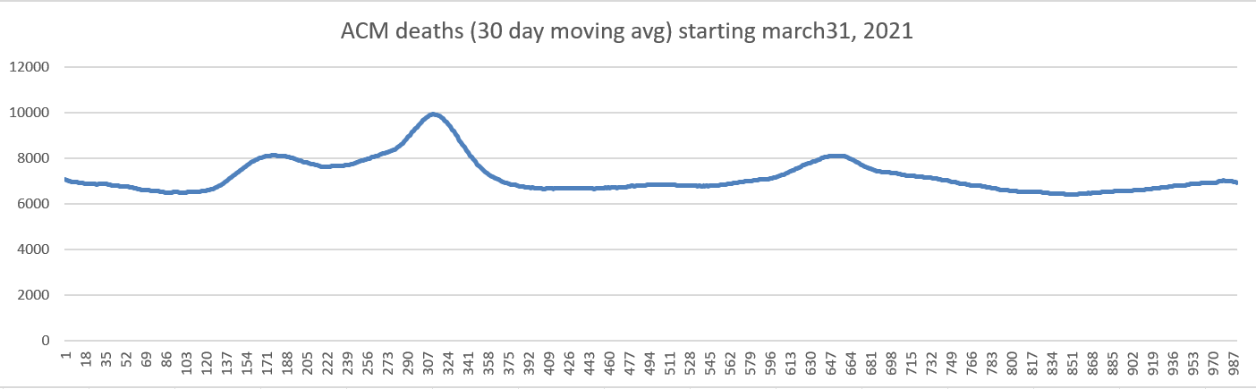 |
Figure 3: We can see the rise in baseline mortality in the all-cause mortality data. The same rise happens in other countries.
Another way to see what is going on is to look at the all-cause mortality baseline death rates before and after the shots rolled out. This is a crude indicator if something is amiss and needs to be explained. Guess what? We find serious elevations in the raw all-cause mortality.
Because Medicare doesn’t publish the daily death rates and the CDC keeps it secret too, the responsibility falls upon journalists such as myself to surface this information to the public.
Here’s the Medicare chart you are never supposed to see:
 |
So we see serious elevations in the baseline mortality after the shots rolled out, just like we do in other countries after the COVID shots roll out.
Could this elevation in deaths be due to an after-effect of the COVID virus itself? No, because as we learned from Denis Rancourt’s work, the excess deaths were not caused by the virus itself, but by the different COVID treatment protocols deployed in different countries.
In this case, let’s use the more conservative 2019 baseline mortality by using the average daily deaths in July:
- July 2019 (baseline): 6065
- July 2021: 6627 (9.2% increase from baseline)
- July 2022: 6811 (12.3% increase from baseline)
- July 2023: 6425 (5.9% increase from baseline)
Also, for comparison purposes for use in the next section, the average peak value at the end of 2022 was 8384, which is a 23% increase from the 2022 baseline. So this is the “seasonal mortality” increase.
But the drug companies have nothing to worry about here because nobody is going to ask any questions about this. This is not a COVID increase. The doctors will ignore it, the mainstream media will ignore it, and Congress is never going to ask any questions about it in any official hearing.
I just thought that you would like to know the truth, even though they don’t want to let you know about it.
So this is further confirmation that mortality is being increased, just as we saw in Figure 2. It’s showing up in Figure 3, just like you’d expect.
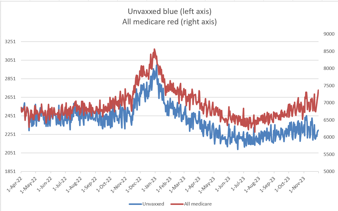
Figure 4: The unvaccinated did better than the vaccinated
Our final figure is deaths of people who didn’t get a vaccine in 2021 onwards and died. This wasn’t the ideal criteria because it is “forward looking” rather than specifying a more objective criteria such as “not being vaccinated by the end of 2021.”
Because this criteria is forward looking, there is a huge artifact that causes the deaths to decline rapidly until around March 2022 when the rates stabilize.
The reason for this is simple: had we normalized this death chart by the total number of unvaccinated alive on each day, we’d eliminate the artifact. Unfortunately, that data is hard to get.
So the first “hump” in the plot below is probably the COVID delta deaths, exaggerated by the size of the cohort and the second peak is the December 2021 peak again exaggerated by the size of the cohort.
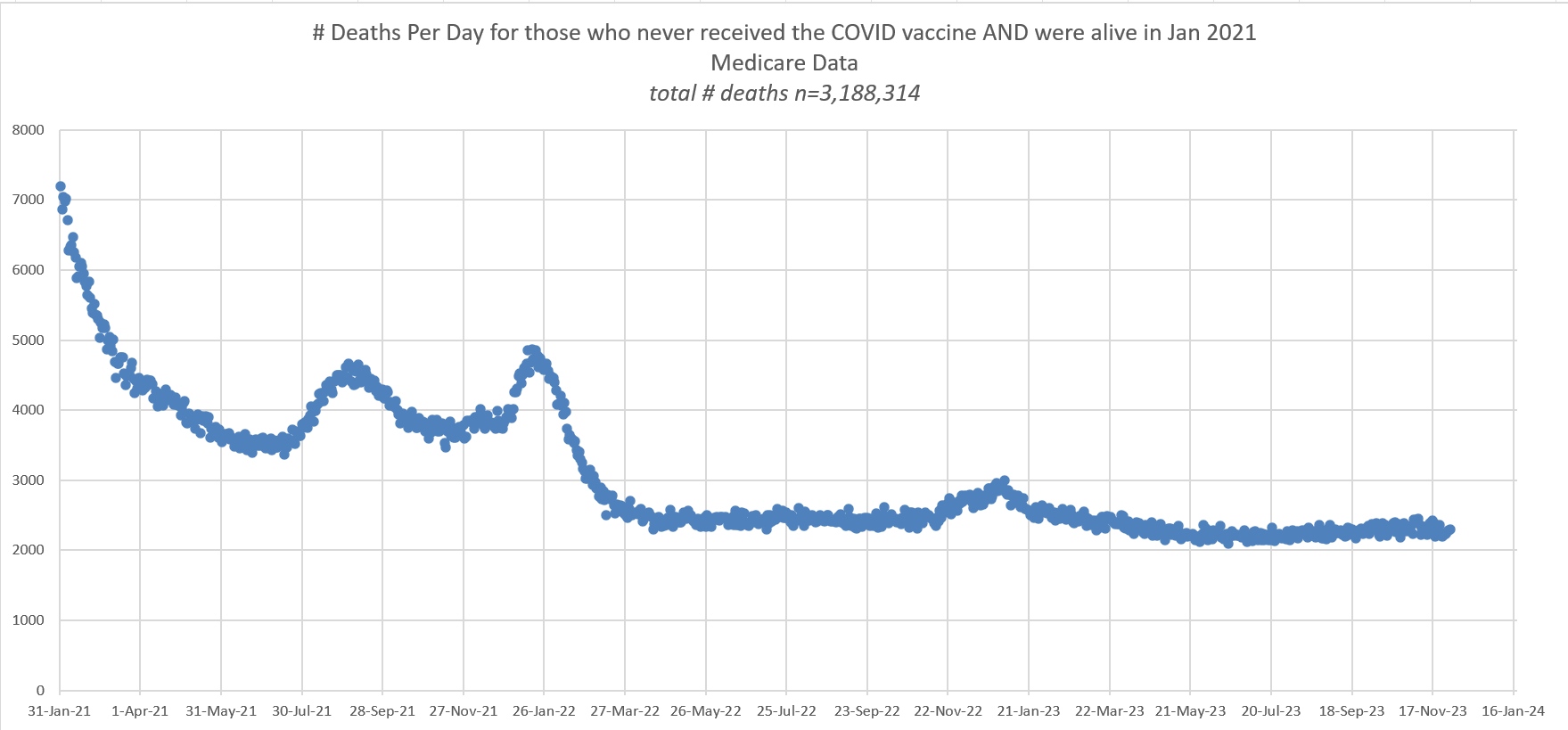 |
They don’t want you to see this chart. It shows that all these booster shots are completely useless because since 2022, there have been no COVID death waves at all.
In short, your doctor told you to get the booster in order to pad the profits of the drug companies. There was absolutely no medical rationale to get these shots. Physicians simply followed orders and told people to get shots that they clearly didn’t need.
And the CDC did their part by hiding this data so that nobody would ever find out that the shots weren’t needed.
The seasonal mortality peak in the chart above at the end of 2022 is 2913 vs. an earlier baseline (July 2022) of 2456. So the seasonal peak was 18.6% above baseline mortality for the unvaccinated while the seasonal peak was 23% for all of Medicare. So the unvaccinated appear to be less affected by seasonality than the vaccinated.
You can see this more clearly where I put both the unvaccinated and the “all medicare” on the same axis. The left axis is scaled by 2.7 to account for the different sizes of the groups on April 1. Over time, you can see that the unvaxxed are dying at a lower rate and the seasonal peak is lower.
 |
Mainstream media will remain silent on this data
Not a single mainstream media publication is going to cover this story. They will simply allow the killing to continue. The days of investigative journalism are dead.
Their rationale is simple: if this were true, the doctors would complain about it and it would be published in a peer reviewed journal. The doctors aren’t saying anything, so it can’t be true. And Medicare will not allow their data to be published since it shows the government killed people. So no papers. Nobody is the wiser.
So the media sits back until the medical community reaches consensus which is something they will never do because of the fear and intimidation tactics and because Medicare will never release the data and Congress is never going to ask for it.
Summary
Our government has all the data I presented here. They just don’t want to look at it. And for sure they won’t allow it to be released or published in any paper.
I don’t think there is any way for anyone to claim that this data is consistent with the hypothesis that the COVID vaccines are safe.
A 10% increase in all-cause mortality translates into around 350,000 excess deaths a year caused by the vaccines. In America today, after just two babies died from infant formula, we shut down the plant. But after a novel, “rushed to market at warp speed” vaccine kills over 750,000 Americans, our government ignores all the adverse safety data in their possession and urges people to inject it on a regular basis.
In any honest society, both the flu shots and the COVID shots would be immediately halted.
But we do not live in an honest society. There isn’t a single honest national government in the world as far as I can tell. None of them are putting a halt to the COVID shots.
 |
Furthermore, none of the world’s governments believe in data transparency. Not a single one will release even the most basic time-series cohort analysis of their shots with weekly buckets which is the lowest level of transparency. Calls for data transparency fall on deaf ears. They are all corrupt.
There is one exception. There is one honest and courageous public health official on planet Earth: Florida Surgeon General Joseph Ladapo. Ladapo took a courageous stand with respect to these deadly vaccines. He wrote, “These vaccines are not appropriate for use in human beings.”
He’s absolutely right. Bravo! The mainstream media should be commending him for his stance. Instead they are vilifying him.
The data supports Ladapo’s position.
Finally, let’s be perfectly clear: nobody in the world is confident that the shots save lives. I still have a million dollar bet open to anyone who believes the shots saved lives (Saar Wilf is in for $500,000, but nobody will come in for the remaining amount).
If people are so confident the shots reduced mortality, why aren’t they accepting my bet? Even the drug companies aren’t standing behind their product! They are all fine risking your life but when it comes to risking their money? No way. They cannot explain this data so they will ignore it and try to make sure nobody reads this article.
If you think I’m wrong or Denis Rancourt got it wrong, you are welcome to challenge either or both of us in a recorded public forum so we can have a civil dialog about how this data should be interpreted. Simply respond to the pinned comment below.
And that’s why it is critical that you share this article so we can inform others of what the US government data says.
From Steve Kirsch’s Substack

Your Tax Free Donations Are Appreciated and Help Fund our Volunteer Website
Disclaimer: We at Prepare for Change (PFC) bring you information that is not offered by the mainstream news, and therefore may seem controversial. The opinions, views, statements, and/or information we present are not necessarily promoted, endorsed, espoused, or agreed to by Prepare for Change, its leadership Council, members, those who work with PFC, or those who read its content. However, they are hopefully provocative. Please use discernment! Use logical thinking, your own intuition and your own connection with Source, Spirit and Natural Laws to help you determine what is true and what is not. By sharing information and seeding dialogue, it is our goal to raise consciousness and awareness of higher truths to free us from enslavement of the matrix in this material realm.


The 1 % Jewish elite responsible for the poison covid vaccines and most have changed their surnames . want to depopulate the world and leave 500 million humans to be their slaves along with Artificial intelligence robots .Over half of America's politicians are Jewish and most have changed their surnames in America and in every country ! That's why no one is helping the people with the genocide happening in Palestine ! Say No ! to the Jewish wars ! Say No ! to the Jewish central bank digital currencies ! Say No ! to the Jewish artificial intelligence robots ! Say No ! to the Jewish depopulation of earth agenda !
Truth Honor & Integrity Show
The Jewish race evolved from the alien gray sub race around 40000 years ago
https://www.youtube.com/watch?v=HyUJiLAVz0s